Case study, Lema
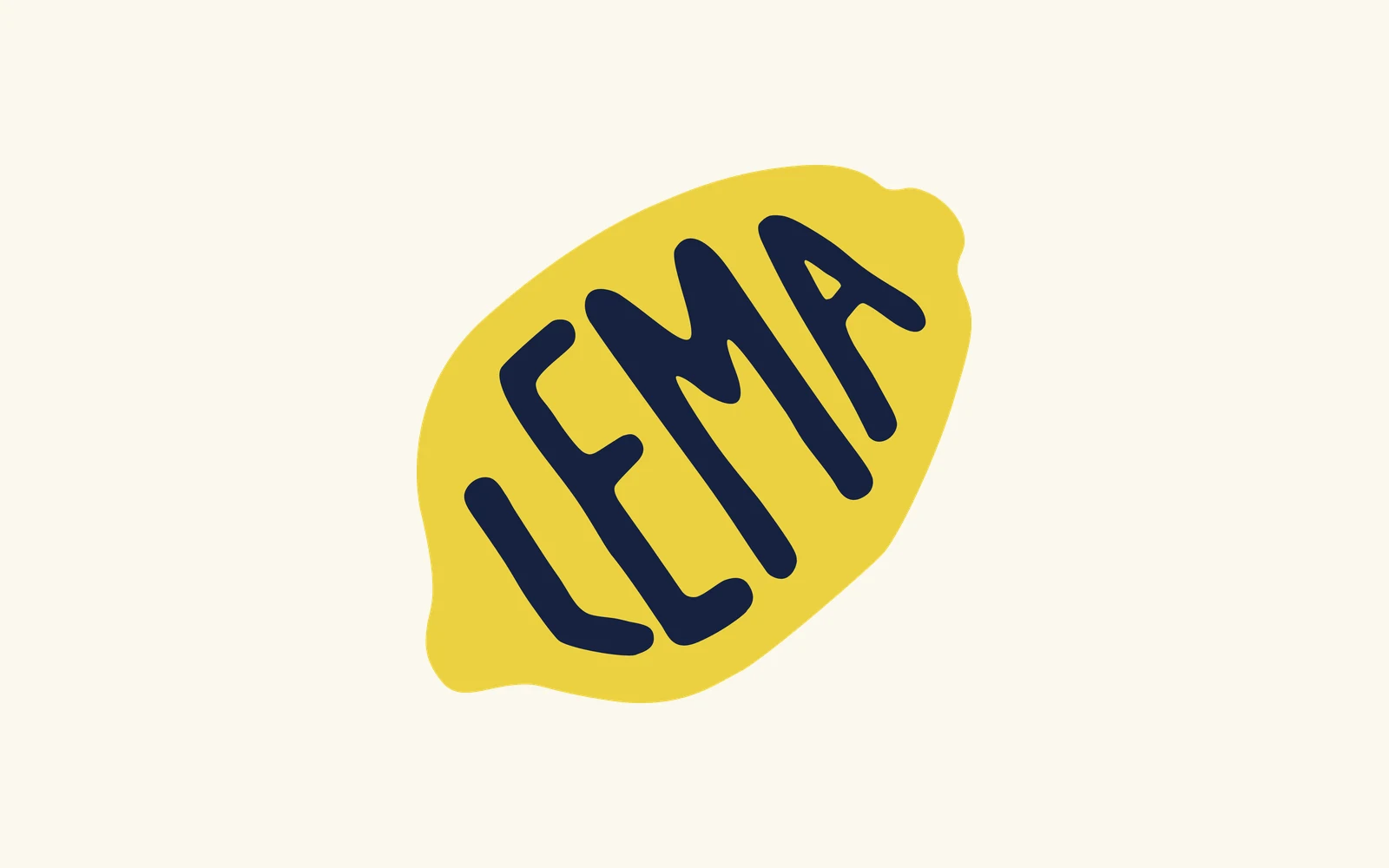
A hand-drawn lemon for Lema
Lema is a speed-dating web app in London where users only hear each other on five-minute voice calls, and the matches show up the next morning. When the founder came to me it already had its brand guidelines, but the logo was typed-out text. The ask was to add a human touch to the app, which was vibe coded.
- Role
- Sole designer
- Timeline
- 4 weeks, Sep 2026
- Team
- Me, with the founder
- Tools
- Affinity Designer, Figma, Procreate
- 48drawings
- 4directions
- 32colourways
01
Everything but a logo
The founder had already put real care into Lema. The colours, the two fonts and the rules for buttons and screens were written down and tested, so my job was clearly the logo.
He wanted a real logo, and we agreed that a human touch of rawness would elevate the design. It would also build trust in the app.
After measuring the colour palette early on, I realised navy is the only dark colour, and the other five are all light and close to each other, so any version of the logo that's easy to read needs navy on one side of its edge.
02
48 drawings
I sketched by hand, and the drawings fell into five rounds. I started with a plain lemon and how much scribble it could take, tried adding a leaf (and a few faces), played with the line about lemons (yes, "when life gives you lemons" got its moment), and then drew the word itself in script, lower case and capitals.
Capitals inside the lemon won. Once the word filled the fruit, the name and the lemon became one shape, so the logo never needs a lemon stuck next to it. The last 21 drawings were all about the letters: their proportions, how the strokes end, and how heavy they feel.
03
The magic of thirty-five
Three things in the logo are 35. The letters lean 35 degrees, they sit 35 pixels inside the edge of the lemon, and the stroke is about 35 pixels thick.
Then I loosened it so it still feels drawn. The A leans a little further than the other letters, the gaps between letters get wider as the word goes, and the stroke is thicker in some places than others (even inside a single letter). That wobble is what makes it look like someone made it, so the guidelines ask people never to straighten it, retype it or smooth it out.
To build it, I redrew my chosen sketch in Affinity Designer with the letters standing upright on a grid inside the lemon's outline. Once I'd measured the gap to the edge, I turned the whole thing into place.
1. The sketch I chose.
2. The letters redrawn upright on a grid.
3. Measuring the gap to the edge.
4. Turning it into place.
04
Making one drawing work everywhere
Everything comes out of the same drawing, so there's nothing to keep in sync: the full logo, a square tile for app icons and avatars, the lemon on its own, and the lettering on its own.
The drawing also decided the smallest size. The tightest gap is between the L and the E, and it closes up below 104 pixels, so anything smaller uses just the lemon. The lemon holds all the way down to 16 pixels, which is why it became the favicon.
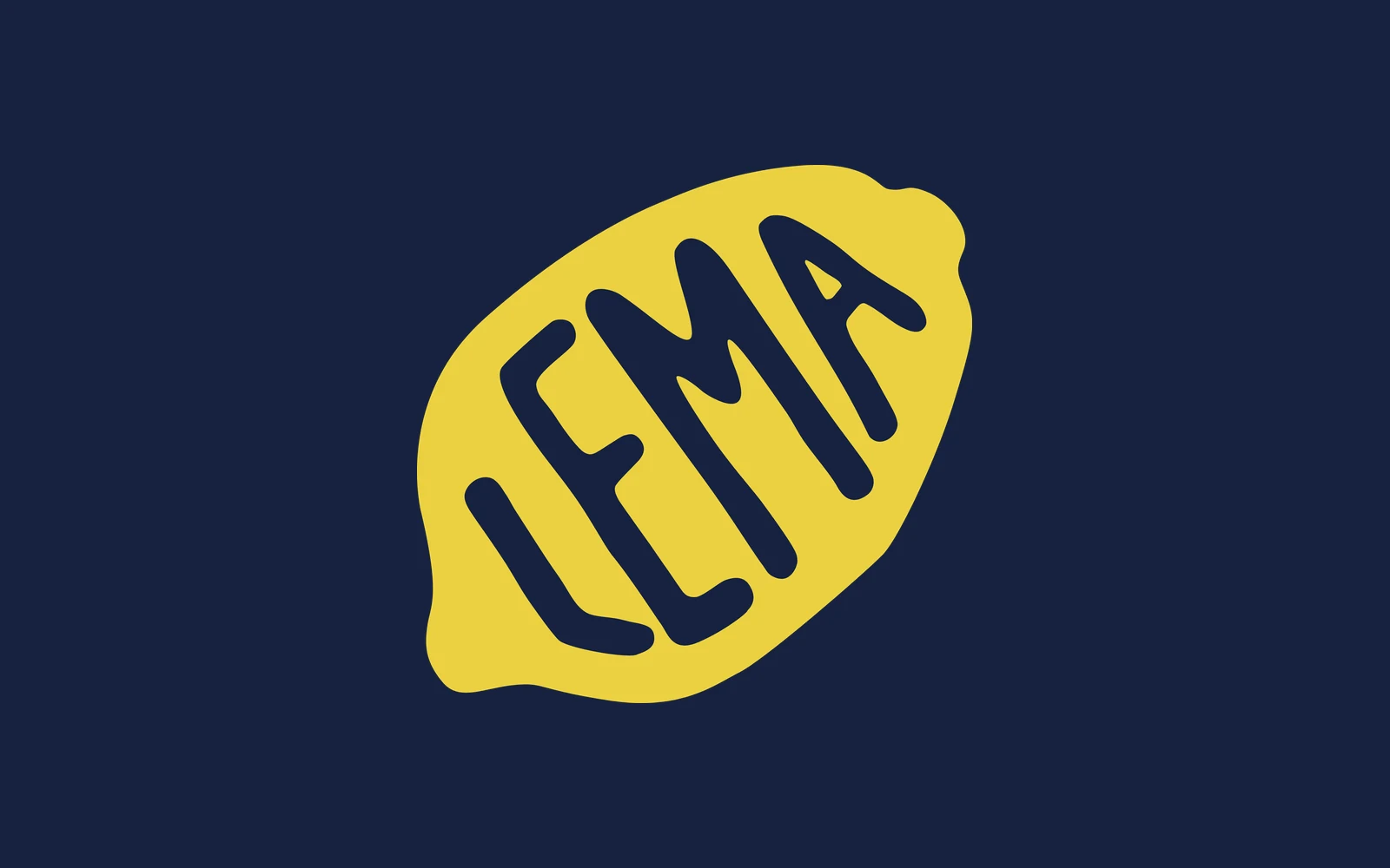
Four backgrounds made the cut, the same four the app already uses. The logo reads fine on coral and sky too, but those are his accent colours, and putting the logo on them would have two accents competing for attention. He approved all 32 colourways, and I marked six as the ones to reach for first.
05
Keeping the lemon off most screens
The brief asked for no lemon on every screen, so most screens don't have one. The logo sits in the header, the lemon on its own opens the app, and during a live call there's nothing at all, because two strangers are talking and that moment needs to feel calm and safe.
Outside the app the same rules work for banners and billboards, where someone gets about three seconds to read it from across the road.
06
What Lema has now
Lema has a raw logo, a 23-page guide and 58 files ready to use.
Keeping the hand-drawn feel
My natural instinct was to draw something that has rhythm, but when I made options that looked too polished, they lost the human touch. I had to then intentionally break rules at certain places to get that rawness.