Case study, a top-5 US bank
One platform for a process that ran on emails
A top-5 US bank set up about 15,000 control agreements a year, across a $130M portfolio, through 13 teams, 16 tools and a lot of email. I led the research, the service blueprints and the UI design for the platform that replaced it.
- Role
- Lead UX Designer
- Timeline
- 6 months
- Team
- 2 designers, 1 director
- Tools
- Figma, Mural
- 67%less processing time
- 2,000employee hours saved a month
- 84%of documented pain points resolved
01
A three-week process held together by email
A DACA, a deposit account control agreement, is a three-party agreement that lets a lender monitor and control a borrower's account as security for a loan.
Setting one up, changing it or ending it passed through 13 teams and 16 tools, from spreadsheets to fax. Details were typed in again by hand at almost every step, requests were forwarded by email, and nobody could see where a request had got to. A new agreement took 3 weeks or more.
02
Everyone was missing the same thing
With the two other designers on the team, I ran 15 interviews across 12 roles, from the relationship managers who talk to clients to the implementers who make sure the money moves correctly, and we drew four personas from them.
Robert Rapport
RM / TMO
"Clients want updates on the DACA status but it can be challenging since we have little to no visibility on where the DACA is in the process."
Sally Sales
SC / RSA / CAC
"It is a lot of movement, systems and we need to track all of this."
Charlie Corrector
TM Doc Review
"Because of our guidelines I often end up sending things back."
Izzy Tater
Implementer / Wire
"I have to juggle a lot of systems to access the information I need. This should be easier."
No single source of truth.
Every role, from the client-facing managers to the back office, was chasing status through emails, calls and cross-checks between systems. That became the brief for the redesign: one system that everyone can see, end to end.
03
The brief was a new UI, but the problem was the process
In the prioritization workshop the teams sorted every need into must, should and could have. More than 75% of the must-haves were process problems that no new screen could fix, so the scope widened from UI design to redesigning the process along with it.
The bank was in the middle of a modernization, so not everything could be built at once, while the teams wanted some fixes as soon as possible. I split the future state into two phases. Phase 1 is what could be built on the near-term roadmap, and Phase 2 adds fuller automation and a portal where clients submit requests themselves.
04
Four screens, each answering a break in the blueprint
-
Solves: details typed in by hand
A smart intake form
Fields fill in from the client's existing records, options adapt to earlier answers, and choices that contradict each other switch off. The submit button stays disabled until the form is complete and says what is missing, so errors stop at the first step instead of surfacing three teams later.
-
Solves: requests lost in email
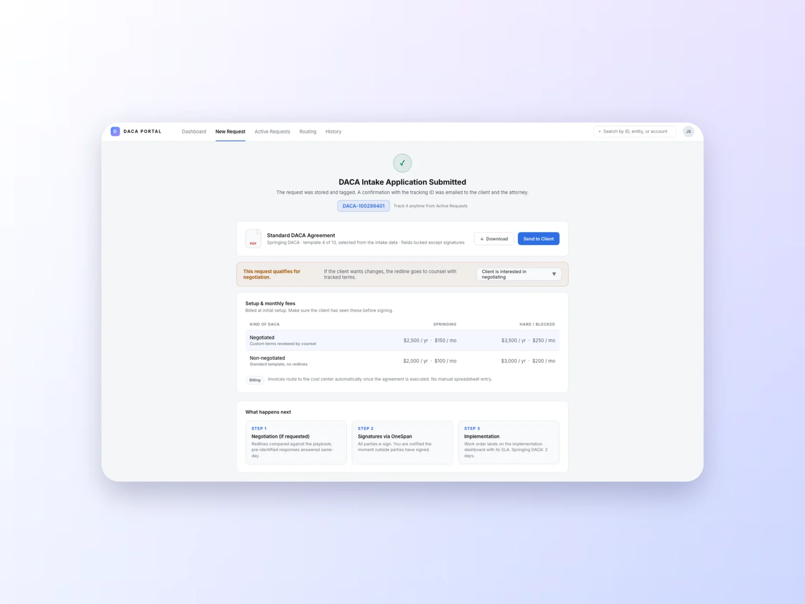
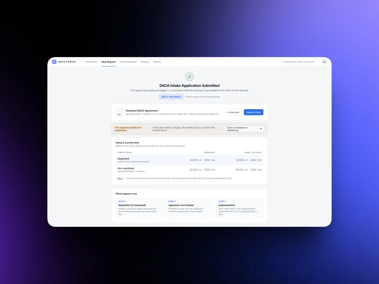
An agreement and a tracking ID on submit
As soon as a request is submitted, the standard agreement is ready to send to the client or download, and the request gets a unique tracking ID that follows it from intake to implementation.
-
Solves: requests forwarded by hand
Routing by the bank's own rules
Requests route automatically against the bank's business rules, to approval, decline or manual review, so the same path runs for every request. Urgent request types carry deadlines and escalate if nobody picks them up.
-
Solves: no visibility
One place to see every request
A shared dashboard shows every request and its status in real time, filtered by team, type and priority, so nobody has to send an email to find out where something is.
05
What changed
In the future state, setting up a new DACA takes about a week instead of 3 or more, a 67% cut in processing time. Around 2,000 employee hours a month no longer go to rework, validation and typing details in by hand. And of all the pain points documented in the interviews and workshops, 84% are solved.
Scope moves as you learn
The workshop turned a UI brief into a process redesign, so I kept every team informed as the scope changed.
Wireframes draw the most feedback
Stakeholders gave the most feedback on wireframes, so I now plan extra days for those conversations.